Helvetica and Grid Based Design
(photo by aeioux)
I’ve been trying to get more into the graphic design aspect of web design recently. I’m not trying to become a graphic designer, but I am trying to figure out why some designs are better looking than others.
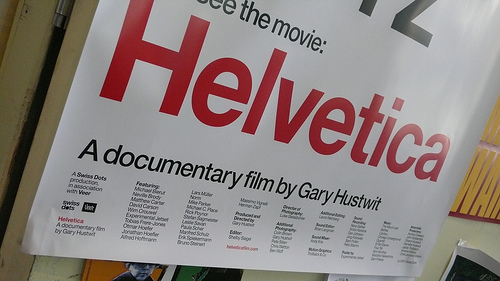
On Sunday night I got the chance to see the movie Helvetica at the AFI on Sunday night. As the director joked before the screening “it is a movie about a font.” But it was an incredibly good movie about a font. The passion of all the designers was amazing. It was funny, informative, and beautifully shot and directed. If you are a graphic designer, have to work with graphic designers, or care at all about design go see it if you if it screens near you. Otherwise get it on DVD in October.
The designers pretty much fell into two camps: either they loved Helvetica or they hated it. Both camps had fantastic designers who created beautiful work. That said, I found myself nodding along when the designers in the pro-helvetica camp talked. Most likely I identified with them because at the moment I view most everything through the lens of web design. The main complaints against Helvetica were that it was overused, boring, and was a lazy choice when there are so many other good typefaces to choose from. But on the web we already have a limited pallet of fonts so we don’t have much choice but to use something that is overused. Given that constraint the simplicity, elegance, and readability of Helvetica makes it a natural choice.
This leads me to my second, semi-related note. I’ve been in love with the design of Khoi Vinh’s blog Subtraction since the first time I saw it. The simplicity, readability, and the way it remains expressive with a monotone pallet (and a splash of orange for rollovers) amaze me. Khoi is the lead designer for the New York Times Online and is a big proponent of grid based design. Grid based design came out of the modernist movement which is what produced Helvetica and is how this is semi-related to the movie.
Khoi did a session at SxSW with Mark Boulton that had been on my “to-read” list for quite some time. I finally got to it today and highly recommend it to anyone interested in grid based design. The session walks through a hypothetical redesign of a yahoo-like web property using grid based principles. I really enjoyed it and plan to use the techniques the next time I have a site to design.
One quick trick they mentioned was to have equal padding on the top, left, and right sides of an element, but slightly larger padding on the bottom. This apparently appears more balanced to the human eye and is a technique that has long been used by framers when matting.
Both the slides and the audio are available online. Page through the slides while listening to the audio for best effect.
More Articles on Software & Product Development
- Agile With a Lowercase “a”
- ”Agile“ is an adjective. It is not a noun. It isn’t something you do, it is something you are.
- How Do You End Up With A Great Product A Year From Now?
- Nail the next two weeks. 26 times in a row.
- Build it Twice
- Resist the urge to abstract until you've learned what is general to a class of problems and what is specific to each problem.