Calling Attention to Features

- Double click any word to get a definition
Josh Evnin just wrote a nice little blog entry on a new feature at NewYorkTimes.com. Double click any word in any article and a popup comes up with reference information on that word. For instance, double clicking on the word trust in the above article about Barack Obama's finances brings up this explanation of a blind trust.

- The reference information you get by double clicking on trust
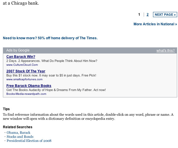
I think this is an excellent HCI device for a site like the Times where users may need a quick introduction to a subject they are unfamiliar with. Unfortunately, the text announcing the feature is hidden way at the bottom of the page, past both the end of the article text and the pagination controls. I never would have noticed it all the way down there and I think most other users would have missed it too.

- What good is a cool feature if your users don't know about it?
I would suggest putting the Tips in the sidebar below "More articles in [Section]" with the header in red. This draws attention to the tip, without getting in the way, and would allow other site tips to be shown. Giving users subtle ways to learn helps get them into what Kathy Sierra calls the kick ass zone quickly. And users that love your product are the best advertising you can have.

- My design draws attention to the tip, and allows for the user to get more
Another alternative would be to put a link in the top navigation bar like how google draws attention to new features. They put a link in the upper right cornet in bright red text with an exclamation point.

- Google knows how to unobtrusively help users learn
Users who are interested see that there are new features and can learn about them, but the regular interface isn't crowded with information irrelevant to the task at hand. It is unobtrusive. And letting users get their work done without getting in their way has to be one of our main goals when designing web apps.
A good interface, like a good waitress, is invisible.
- Carrie Bickner in Web Design on a Shoestring
More Articles on Software & Product Development
- Agile With a Lowercase “a”
- ”Agile“ is an adjective. It is not a noun. It isn’t something you do, it is something you are.
- How Do You End Up With A Great Product A Year From Now?
- Nail the next two weeks. 26 times in a row.
- Build it Twice
- Resist the urge to abstract until you've learned what is general to a class of problems and what is specific to each problem.