Explanatory Text is a UI Design Smell
I’ve had to switch the phone on my Verizon account a few times in the last couple of weeks. Verizon has an online tool that makes it pretty easy. You login to your account, click on “My Phone”, click “Activate a Phone” and then enter your ESN or MEID. The ESN or MEID is the unique identifier of the handset and is typically found in very small text underneath the battery.
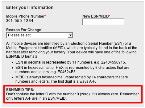
All in all it is a very good experience and makes a fairly arcane task pretty easy. However, there is one bit of explanatory text (highlighted in red) that offers an opportunity for an improved user experience.

Since ESN or MEID is either in decimal or hexidecimal there never will be the letter O it will always be the number 0. However, my mother shouldn’t have to think about hexadecimal base numbers if she is changing her phone. A better solution would be to just treat the letter O as the number 0. Then the user doesn’t have to worry about it, and you can get rid of the explanatory text.
This reminds me of code smells. A code smell is a symptom that there may be deeper issues with the code. For instance, long methods are a code smell. They don’t mean that there is necessarily a problem with the code, but they do suggest that there is a good chance there is.
I think that long blocks of explanatory text are a User Experience smell. Sometimes there isn’t a better option, and you really need that text, but in most cases a little extra thought about the UI can eliminate the need for the explanatory text.
More Articles on Software & Product Development
- Agile With a Lowercase “a”
- ”Agile“ is an adjective. It is not a noun. It isn’t something you do, it is something you are.
- How Do You End Up With A Great Product A Year From Now?
- Nail the next two weeks. 26 times in a row.
- Build it Twice
- Resist the urge to abstract until you've learned what is general to a class of problems and what is specific to each problem.