Redesign
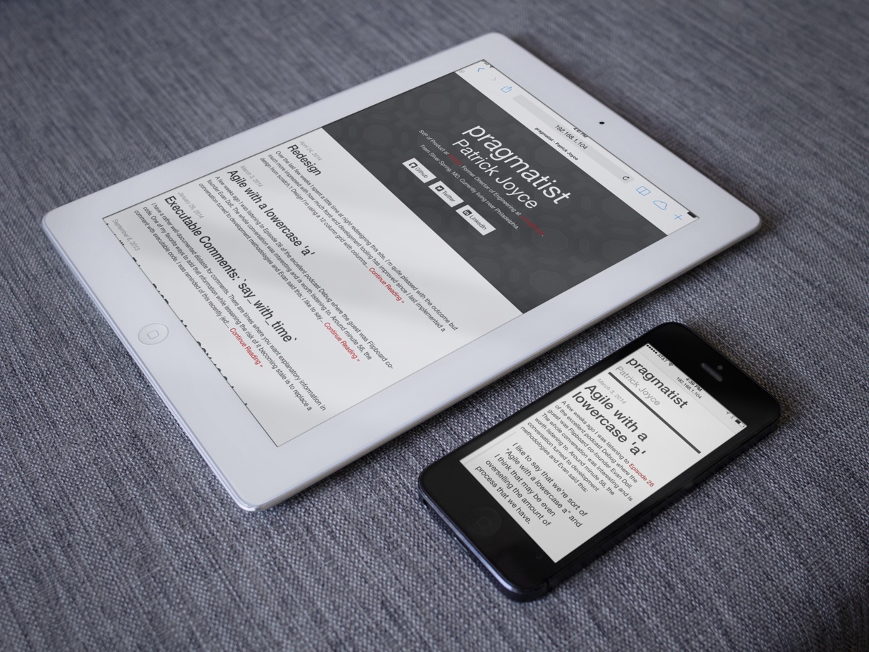
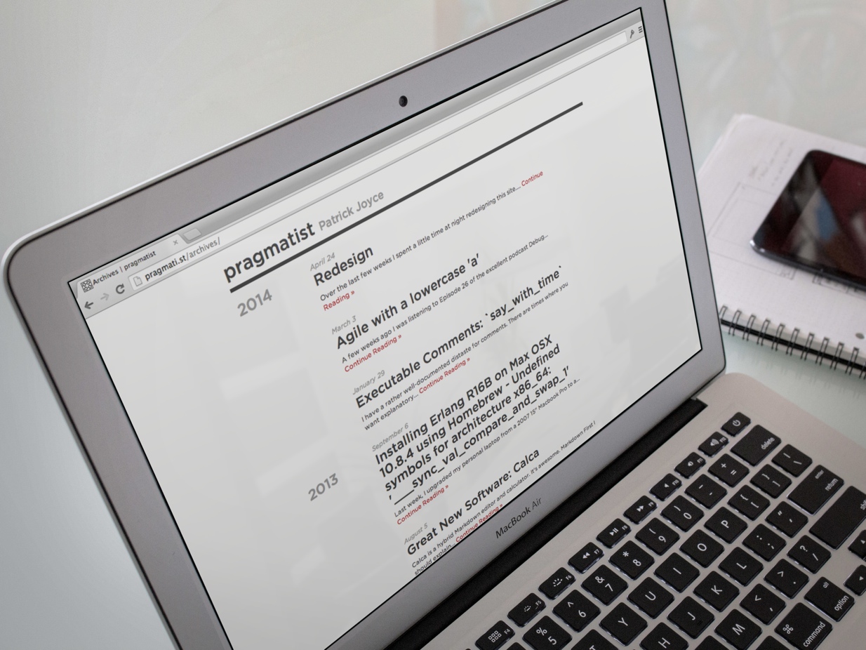
Over the last few weeks I’ve spent a little time at night redesigning this site.
I’m quite pleased with the outcome and even more impressed with the improvements in front-end development tooling since I last implemented a design from scratch.1

Design
Design is about making decisions in service of a goal. For this design I had a few goals:
- The design had to work well on phones, tablets, and desktop.
- The article page should be focused on reading.
- I wanted to guide visitors to some of my favorite articles.
- I wanted support extra information as end-notes or side-notes.
- The homepage should quickly introduce me and my work history.
- Visually, I wanted a very stark design primarily defined by type.
The cover image on the homepage is a masked version of a photo I took of the ceiling at the Plaza de España2 in Sevilla.
The site is set in Gotham. I’ve been enamored with Gotham for some time and am pleased with how it looks on the web (particularly on retina screens)
Icons are implemented using Font Awesome, which is in fact awesome.
Notes are styled as side-notes on desktop3 and end-notes on phone and tablet sizes.

Tools
Redesigning my personal site served as a good excuse to learn some new tools. This site is built using the following tools.
Jekyll
You’re reading static HTML generated with Jekyll. I previously used Octopress which wraps Jekyll with some additional tooling and includes a few additional plugins which are nice.
In this revision I switched to plain Jekyll because Octopress hasn’t been updated in some time and Jekyll gave me everything I wanted.
Bootstrap 3
Bootstrap 3 is fantastic.
I liked Bootstrap 2. We built an internal CSS library at LivingSocial based on it that greatly improved the speed and consistency of our front-end development.
That said, the maintenance concerns around Bootstrap 2 were completely valid. It was difficult to keep up to date once you began customizing it. The grid system did introduce a ton of extra <div class="col-md-3"> noise in your markup.
Bootstrap 3 (and LESS) solves both of those problems. Customizations can be made easily by overriding a few variables and you can use mixins for the grid system without polluting your markup with non-semantic tags.
I am by no means a designer. Starting with a blank canvas is overwhelming. Bootstrap gives me a well-thought out type scale, spacing scale, and grid. I can then make a few customizations and end up with a clean, consistent design.4
LESS
CSS preprocessors are a massive improvement over writing plain CSS.
I touched on the benefits of using LESS with Bootstrap above. LESS itself makes writing CSS much simpler.
I’ll admit I worked through most of the design of this site using plain CSS. Then I added the tooling to compile LESS and reworked my stylesheets to LESS. I wish I hadn’t waited so long.
Using LESS (or SCSS) is like moving from SVN to git. CSS didn’t bother me before (just like SVN didn’t bother me before I started using git) but I can’t imagine working in plain CSS ever again.5
CSS3 @font-face
The last time I was doing serious front-end development browsers didn’t yet widely support web fonts and foundries weren’t licensing fonts for the web. So when our designer fell in love with Rockwell for headers we didn’t have a lot of good options.
I still have flashbacks about the many, many hours of my life I lost cutting images of text.
Browser support has now advanced enough that using custom fonts is easy. To use Gotham I signed up for an account at cloud typography. I included one stylesheet in my markup:
<link rel="stylesheet" type="text/css" href="//cloud.typography.com/6703492/656624/css/fonts.css" />and overrode two variables in my LESS stylesheets:
@font-family-sans-serif:  'Gotham SSm A', 'Gotham SSm B', "Helvetica Neue", Helvetica, Arial, sans-serif;
@headings-font-family:    'Gotham A', 'Gotham B', "Helvetica Neue", Helvetica, Arial, sans-serif;
and now my site is set in a lovely face.
Bower
Bower is a package manager for front end assets from Twitter.
Package management beats the hell out of manually managing dependencies. Previously I’d use rubygems to manage front-end assets, but as my former colleague Dave Copeland points out it is sort of insane that “Rails 4.0.4 depends on version 2.2.x of the jquery-rails gem which in turn bundles 1.9.1 of JQuery.”
Bower removes that level of indirection. Suffice it to say, I’m never going to use rubygems to manage front-end assets again.
Grunt
Grunt is a task runner for JS. To generate the stylesheets from less I run:
> grunt less
And to copy the site up to my server using rsync I run
> grunt exec:deploy
Of all the new tools I used on this project this is the one I’m least convinced of. I prefer Ruby over JavaScript so might move back to Rake.
Closing Thoughts
This project was about as simple as a site design gets: there are only three templates. But there are a lot of decisions in those three templates.
My job is no longer to build things directly. I spend my days building teams that build products and I love my job.
But it was a refreshing change of pace to build something entirely by myself, for myself. I enjoyed it immensely and hope that the improved site design will prompt me to write more.
-
Which was probably back in early 2010 with the second design of LivingSocial Deals (as seen on TV ↩
-
The Plaza de España is one of my favorite places—if a bit of a tourist trap—and would be recognizable to Star Wars fans as the Palace on Naboo ↩
-
Some would argue this leads to all sites looking sort of the same, but I agree with my former colleague Brent Jackson that visual homogenization isn’t really a problem. ↩
-
LESS, SCSS, and git all show the importance of a good upgrade path to drive adoption. git-svn let several of us try out git and see many of the benefits before having to convince the whole team to switch. Similarly, because LESS and SCSS are supersets of CSS it is very easy to start using them without having to rewrite all your existing CSS. Contrast this with SASS which has a completely different and incompatible syntax. I thought SASS was interesting, but it required way too much of an upfront commitment for me to ever make the switch. ↩
More Articles on Software & Product Development
- Agile With a Lowercase “a”
- ”Agile“ is an adjective. It is not a noun. It isn’t something you do, it is something you are.
- How Do You End Up With A Great Product A Year From Now?
- Nail the next two weeks. 26 times in a row.
- Build it Twice
- Resist the urge to abstract until you've learned what is general to a class of problems and what is specific to each problem.