December 11, 2014
Email Design from OpenTable
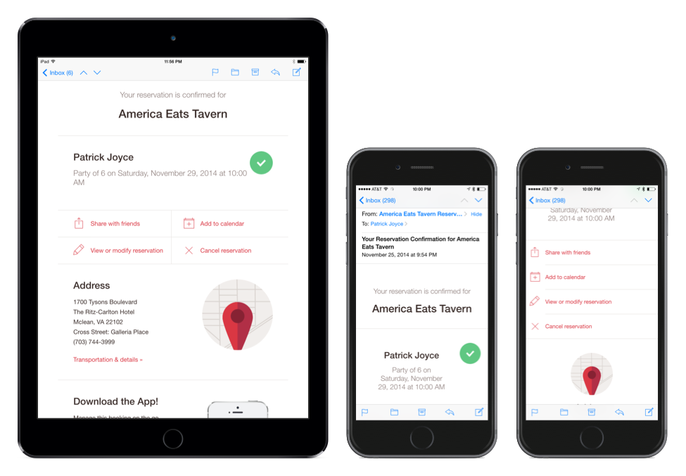
I very much like the new1 confirmation email design from Open Table. This design is clean:
- It clearly presents the most important information (when and where your reservation is) and provides clear callouts to add to your calendar, share, change your reservation or cancel.
- The design also scales from small screens to large screens with some light responsive techniques.
After the important information there is quite a bit of advertising, but because it is after the relevant information it doesn’t detract from the overall experience.
-
At least new to me. I don’t know when they launched this design. ↩
More Articles on Software & Product Development
- Agile With a Lowercase “a”
- ”Agile“ is an adjective. It is not a noun. It isn’t something you do, it is something you are.
- How Do You End Up With A Great Product A Year From Now?
- Nail the next two weeks. 26 times in a row.
- Build it Twice
- Resist the urge to abstract until you've learned what is general to a class of problems and what is specific to each problem.
